Mobile access is one of the fastest-growing sectors of Internet use. Estimates suggest that two out of every three minutes spent online are now on electronic mobile devices, whether that means smartphones, tablets, e-readers, or other gadgets.
Crafting mobile-friendly web design is more important than ever, especially for businesses. Studies suggest that you only have 10 seconds to make an impression on web users before they move on, so letting them know loud and clear what they’ll get out of your company’s website is crucial for a good first impression.
We’ve compiled some of our best professional website design tips for businesses looking to go mobile. If you’re in doubt about how to maximize your internet presence through a mobile device, contact us about our web design packages to get your company on the right track to success.
- Always Test on Multiple Browsers and Devices
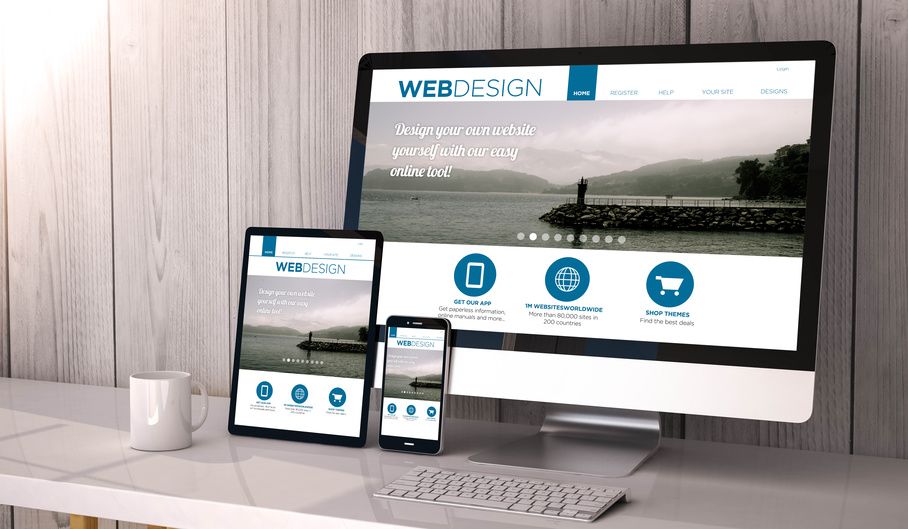
Every device is different, from iPhones to Kindles to Androids to Surface tablets. A responsive website design that automatically adjusts for screen size and orientation with every device and every type of browser is the key to across-the-board success and customer satisfaction. - Optimize Visual and Text Content
Remember that the viewing screen on most mobile devices is much smaller than the average computer. Your most important information should be in large, readable text, while your images should be be complementary. Any navigation features need to be accessible and clickable without too much hassle. - Avoid Information Overload
We find that simplicity is key for mobile web design. Many devices don’t support Flash or cookies, so it’s best to leave them out of the picture altogether. Most importantly of all, it’s good to visualize yourself as the customer on the other end of the screen: What do they need to know right now, and how can you convey that information to them? A successful hook will reel in business if you can make the right catch.
The time for action is now. Internet consumption through tablet devices grew by 30% between December 2013 and December 2015, and as more computers on the market are increasingly advertising themselves as “2-in-1” tablet/PC devices, the old computer may become a relic of the past. Don’t get left in the dust because of of a poor web design — get mobile!